Showing posts with label Catherine Pooler. Show all posts

Wednesday, January 11, 2023

Catherine Pooler Love & Lace Release!

 Hi friends,


It's been quite a while since you've seen me! My creativity took a hit when my depression spiked, the new Catherine Pooler sparked my creativity and I couldn't be more excited to show you what I created!


Today's card was inspired by the Roses are Red Stamp Set. I love this layering roses set, it's difficult to mess up honestly. I decided to stamp out 3 of the roses and several of the stems and leaves to create a pretty bundle then fussy cut them out, I recommend that you get the die set though since this was a little tedious!


Ink Colors used:

Rose Petals

Rouge

Garden Party

In the Park

Mardi Gras

Sage

Eucalyptus

Midnight


I used the Double Duty Circle Dies to cut a circle in a rosy pink cardstock, the another out of white cardstock to stamp the "Happy Birthday" from the Roses are Red Stamp Set.


I taped a Halo Light to the back of the card face and centered it on the backside of the white circle and used Double Thick Foam Tape to hold the card face up when I adhered it to the card base. 


I finished it off with a few enamel dots and I think the end result is pretty illuminating! Be sure to check out the entire new release from Catherine Pooler! I hope my card inspires you as much as this stamp set inspired me!


Stop by tomorrow for another new card using the Catherine Pooler new release!

Love,

R. Winn

Thursday, November 11, 2021

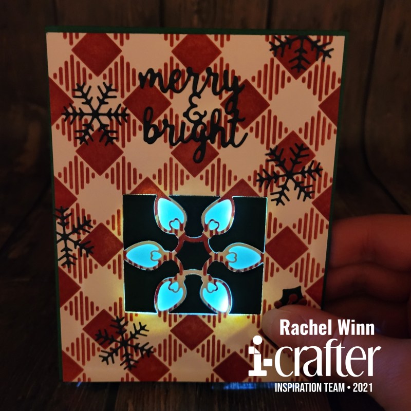
Light Up Christmas Card with i-crafter Dies and Pear Blossom Press Halo Lights

 Hello again friends,

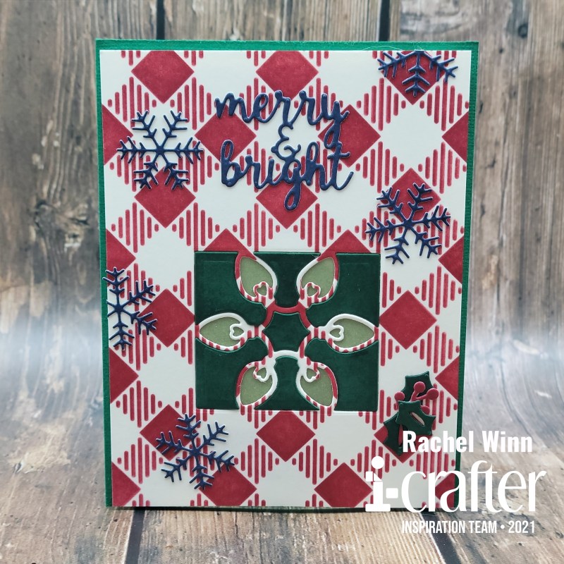
It's Rachel here showing off my take on the new i-crafter Christmas Treat Lantern Add-On die set! I wanted to light this die set up since I first saw it. Since I just did a light up lantern, I thought it would be fun to create a Christmas card instead this time. 

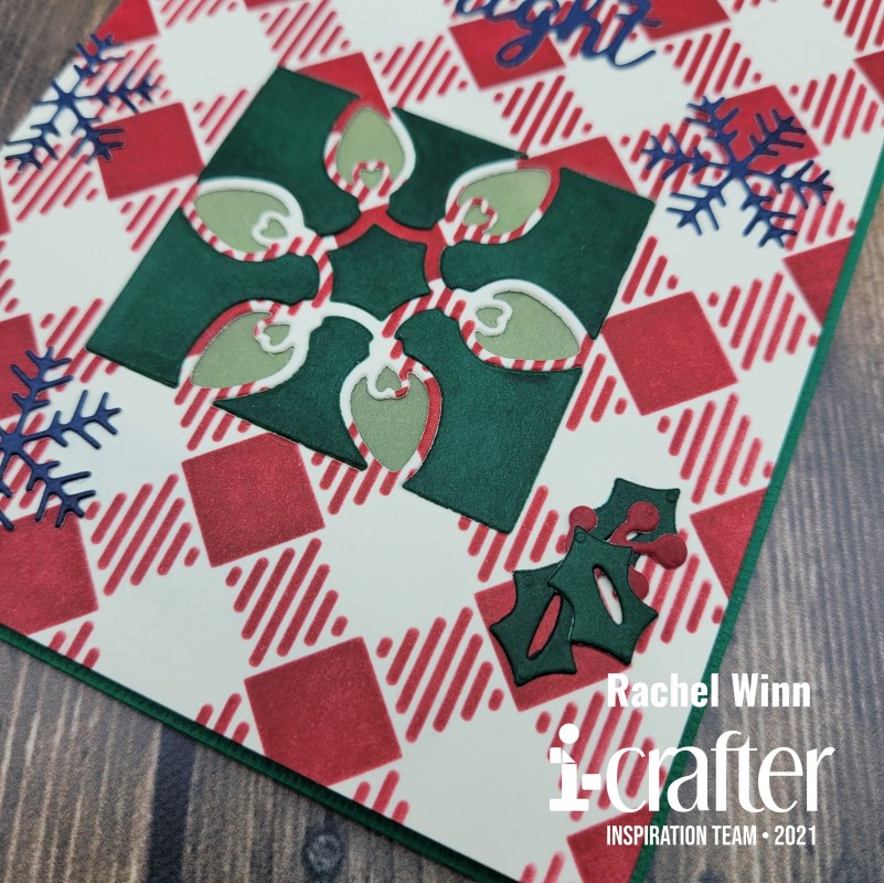
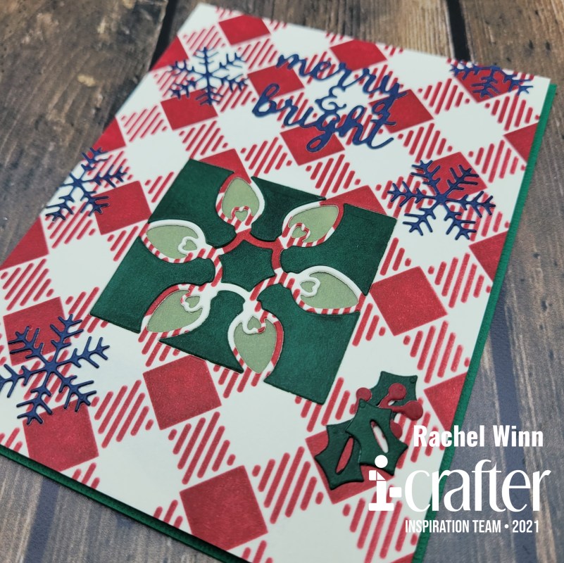
I started with the i-crafters's Buffalo Plaid Stencil and used Catherine Pooler's Cranberry Fizz ink over a vanilla cardstock. Next, I used the lights die from the Christmas Treat Lantern Add-On die set in the bottom center of the panel that I stenciled on. Used Catherine Pooler's Deck the Halls ink on the vanilla cardstock and ink smooshed the pad directly onto the cardstock, then used the lights die again to get the center pieces of the image. To create a yellow glow for the lights, I ink smooshed Catherine Pooler's Chiffon, a bright yellow ink onto vellum and glued it the back of the plaid panel. Once that was glued down, I added the green center pieces back into the image.

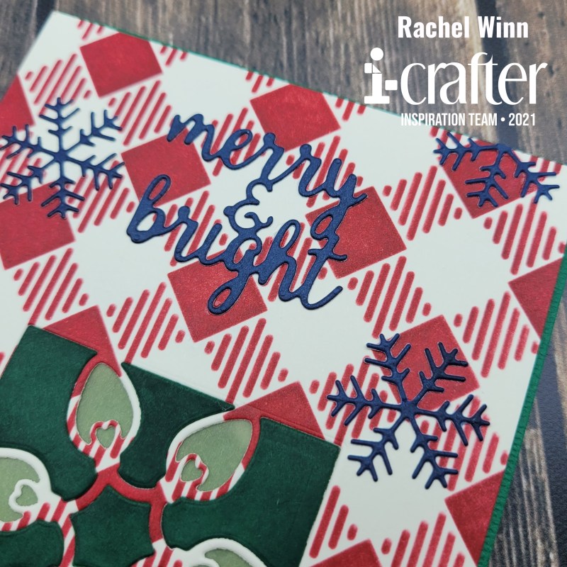
 I used the "Merry & Bright" word dies and the snowflake from the i-crafters's Holiday Dovetail Card die set to decorate the card. Again, I ink smooshed Catherine Pooler's Juniper Mist ink directly onto the vanilla cardstock. I cut out the words and five snowflakes. I cut two down so that I could position them on the edges.

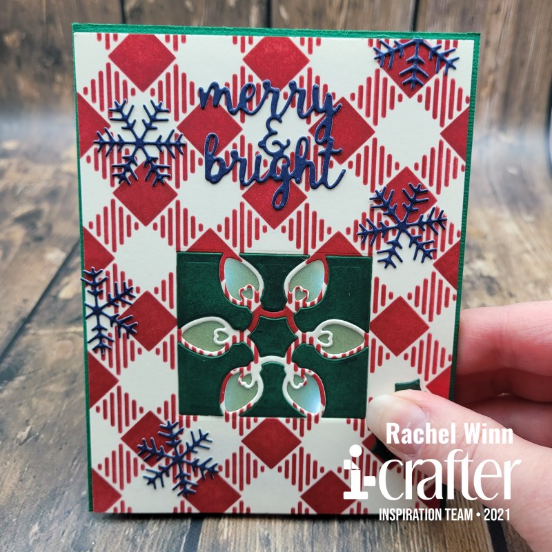
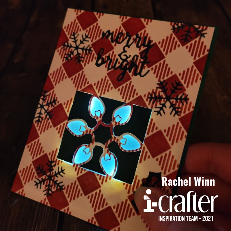
I then took the holly and berries from the i-crafters's Christmas Treat Lantern Add-On die set and positioned them over the button to my Pear Blossom Press Halo Lights, which is what I used to light up the card. I should have taken a picture of the back of the panel before I glued it down. I wanted something quick and easy and the Pear Blossom Press Halo Lights were perfect, they have 4 built in LED lights. I positioned the lights so they hit the corners of the box instead of positioning it straight up and down.

You cane see how perfectly the lights from the Pear Blossom Press Halo Lights worked with the box when it's lit up.

I couldn't be happier with how it turned out!

Here is a short video with the card in action! I hope that you enjoy it as much as I do!

If you’d like to see more of my projects, you can follow me here: Instagram, and Facebook page.

 
Until next time,
Rachel
 
For more inspiration, updates, and news make sure to check out these awesome places!
 
 
Thank you so much for stopping by today!

Wednesday, September 1, 2021

Monster Party with i-crafter!

It's release day with i-crafter and that means I have something spooky to share! I got to play with the new Impossible Box, Monster die set and created 3 fun projects to inspire you!

We'll start with my favorite, I'm calling this one a coffin. I used the pieces meant to create a mummy to create the coffin. I created different colored by smushing multiple shades of Catherine Pooler brown inks onto a sandy colored cardstock. I spritzed the cardstock, sponged some color off with a towel then blow dried it most of the way with my heat gun. Next, I used the Kindred Stamps Woodgrain stencil and dry embossed the cardstock to create a wood texture. 

I cut the mummy pieces out repeatedly, and added a few of the vampire hair pieces in as well (with the points covered by the other pieces.) My box was a darker solid brown. I covered all four sides and the bottom of the box with these panels layering them so they looked like a roughly built coffin. I chose to use red and white for the eyes to make them really POP out at you. The top I left as is so it didn't interfere with the open/close mechanism.

Next up is a fairly simple box! I used old Halloween patterned paper from a Graphic 45 paper pad to create a simple box, I added some bat sequins that I found in the dollar section at Target. I really love that this box can be used dressed up or stand-alone!


I wanted to show the box in use so I added a few of the bats to the inside... then spilled them out for effect. 


Last, we have the first box I created. I want to put the disclaimer out there that this was my learning curve box and it can be done much better than this one... but he's sure a cute little vampire either way!

I added details using Copic markers, using Cool Grays for his hair, blue to add details to his eyes, and red to color his lips. I added buttons to his vest and shirt with a fineliner.


The last few details may be a bit silly, but I thought they were fun. For his cape, I cut the shape out twice, once in black and once in red. I backed the red with the black, then used my i-Press tool's round handle to curl the edges of the cap inwards. 


I hope that you have enjoyed my project for today and can't wait to see how you use the new Impossible Box, Monster die set in the future!

Until next time,
R. Winn

For more inspiration, updates, and news make sure to check out these awesome places!

i-crafter
i-crafter Instagram
i-crafter Art Facebook Page
i-crafter Pinterest
i-crafter YouTube

Thank you so much for stopping by today!

Friday, June 18, 2021

EZ-Lights Creating Bright Days with Catherine Pooler

Hello friends,

Welcome to the Catherine Pooler Designs x Pear Blossom Press Collab Hop! We're sharing fun, interactive cards to brighten your day! They feature awesome new stamps and dies from Catherine Pooler Designs, and with help from Pear Blossom Press, they all really light up! Be sure to hop along with us for loads of inspiration; our designers have come up with some brilliant cards.


We got to play with Pear Blossom Press EZ-Lights with the new Catherine Pooler Bright Days stamp and die set. I think they are a match made in crafty heaven! I created a mini slimline for the hop. I started by stamping the light fixture and light switch out using Midnight Ink on to Catherine Pooler Premium Paper.


Next, I used a Tombow Blender Pen to watercolor the light fixture using Limoncello ink for the light bulb, Cove Blue ink for the top and bottom pieces of the fixture, and Tranquil ink for the glass. The light switch was also colored with a Tombow Blender Pen, for the plate I used Sea Glass ink, for the switch I used Bay Breeze ink. I added some of the illumination lines from the Bright Days stamp to the light bulb and the wall in the Limoncello ink.


I used the light fixture die to cut a hole in the Happy Hearts Patterned Paper that I selected, I wanted it to look like it could be a wall and I thought the pretty diamond grid pattern could be used for that. Once the hole was cut, I fit my colored piece into it and flipped it over to add my EZ-Lights. I used the Narrow Double Thick Foam Tape carried by Pear Blossom Press to create a pocket around the lights (which I gathered at the center of the light bulb) to trap the light in the area I wanted it to be seen. I added the foam tape all over the back of the card, using washi tape to wrangle the wires and glue dots to adhere the lights to the paper.


I added some light blue glittery ribbon to the bottom of the card where I wanted to place my sentiment, then adhered the card front to my card base. Then I got to start building the card front! I added the light switch over the power button for my EZ-Lights, I thought it was clever. The final piece was the sentiment, I selected the yellow hearts Happy Hearts Patterned Paper to stamp on. I love the sentiments in this stamp set and selected the "thank you for brightening my day" to stamp in Bay Breeze ink and used a die cut from my stash to cut in out in a pretty shape. I popped this up on a thin foam tape and centered it over my ribbon.


Here is a short video showing my card "in action".


Every good hop has prizes, right? So Catherine Pooler Designs, and Pear Blossom Press are each giving away a $25 store credit! Comment on this post by June 25, 202 to be entered to win. Winners will be announced on June 28th. Be sure to continue hopping for additional inspiration and entries into the giveaway!

Your next stop on the hop is:

Here is the full line up if you missed anyone:


Rachel Winn (You are here)


Thank you for stopping by today!

Until next time,

R. Winn

Thursday, May 27, 2021

Encouraging Matchbox Stories

Hello again friends!

I am excited to share two projects I created pairing i-crafter's Ribbon Rosette Funny Add-On dies & Matchbox Stories dies! The idea behind the Matchbox Stories is that you can give a little pocket-sized message to someone, or keep it for yourself.
 

My first Matchbox, I pulled out some origami paper that I picked up at Dasio in Seattle forever ago to create a sweet outer sleeve for the box. I then used the Ribbon Rosette, Funny Add-On die that says "did my BEST" to cut a sparkly cardstock from a friend's wedding invite. It was way too pretty to just toss! I used the negative letters instead of the full circle. These were glued to the top of the sleeve.


For the base of the Matchbox, I cut out a pretty raspberry pink. I added another piece of the origami paper to the bottom interior of the box. Last, I added a few acrylic roses that have sat in my stash for years.


This box is for me, to help me remember that no matter what life throws my way, I am doing my best, and to try to stay positive in the face of adversity!


My next Matchbox, seems a bit snarky, but I promise, it's filled with so much love. One of my favorite people in the whole world, has a lot of social anxiety. That being said, they push the boundaries of their comfort zone for the people they love often and have to cope at social gatherings despite the fact that they'd rather be home crafting.


She is self-proclaimed as "Socially Awkward" so the Ribbon Rosette, Funny Add-On for this box was really easy to pick! After cutting the words out, I used the oval die from the Matchbox Stories set to cut out the topper for this box.


I used Catherine Pooler's Happy Hearts Slimline Patterned Paper pack for the sleeve purple sleeve and yellow box base. My friend LOVES color and these heart filled papers just make me smile. Once my Matchbox was built, I added small crystal pieces that are intended to encourage positive energy, protection, health, love, and confidence. This will be easy for her slip into her pocket or purse for those uncomfortable social situations.


Be sure to join the i-crafter Facebook Fan Club, then follow us on Instagram, and Pinterest too! We love seeing all of your creations using the i-crafter products so don't forget to tag us or use #icrafter when you share!

Until next time,
Rachel Winn

Thursday, October 29, 2020

Highlander Travels through Standing Stones

Hello friends!


I am excited to show off the new Kindred Stamps Highlander Travels Stamp Set. This is such a fun set and the people are so fun to color up. I colored each of them up with a combination of PrismaColor and Chameleon colored pencils. I don't use gamsol like a lot of folks, but I do occasionally use a PrismaColor Blender pencil.


The first gentleman, I turned into a English Captain with the fun hat that is included in this set. Next, I used the Kindred Stamps Distress Brick Stencil with Catherine Pooler Twilight and Black Jack Inks. For this card, I used i-crafter's Flip Card, Dashed Circle die. I used the small circle to die cut a piece of the brick paper. 


I used a sheet of paper that has text on it for one side of the flip and then for the other side a sheet that looked like a fancy wallpaper. Next, I added the word "legendary" on the front.


My final touch was a sentiment from Kindred Stamps Villainous Sentiments underneath the flap.


My next card is a little simpler, I used a fancy oval die to cut out the new Kindred Stamps Standing Stones Craft Die then ink blended using Catherine Pooler Inks. I added a second oval out of a dark blue patterned paper that looks a night sky. I stamped and heat embossed "dinna fash" from the Kindred Stamps Highlander Travels Stamp Set which means "don't stress" or "don't worry".


My last card had this beautiful family from the Kindred Stamps Highlander Travels Stamp Set in front of the Kindred Stamps Standing Stones Craft Die

I created a blue sky with fluffy clouds using The Stamp Doctor's Cloud Dies and green grass using their Grass Edger Dies. All of this was layered over a sheet from an Echo Park paper pad that reminded me of burlap. 


My last touch for the card was stamping the "Anything is Possible with Family" sentiment from Kindred Stamps Highlander Travels Stamp Set on the same burlap looking paper, and layering that with the same green from the grass for the interior of the card!


The entire Kindred Stamps October release will be available Friday, October 30 at 8am PST/11am EST. Be sure to subscribe to the Kindred Stamps blog to see a daily line up of sneak peeks from our amazing Design Team and see the full product release on Friday! Come join the Fan Club and release event to be part of the release fun, and you may just win some Kindred Stamps credit!!

Thank you for visiting today, I hope that you enjoyed my take on this set.

~R. Winn

Thursday, July 23, 2020

Pixie Dust

It's release week at Kindred Stamps and I have 3 cards that I am so excited to share with you! 

My first card shows off the new Pixie Dust Slimline Stencil paired with the Kindred Stamps Happily Ever After Glitter Gloss. I used Pixie Spray to hold my stencil down while I added the Glitter Gloss which allowed me to easily reposition the stencil from the top edge to the bottom edge. 

I used Catherine Pooler Blue Suede Shoes ink to stamp a sentiment from the new Pixie Dust stamp set and placed it in the center of the trails of pixie dust. 


For the adorable fairy from the Pixie Dust stamp set, I colored her up with Copic markers and added blue Wink of Stella to her wings which made them SO sparkly! I stamped out the "I believe in you" sentiment onto dark blue paper, and heat embossed it with gold embossing powder. Then I added the "pixie dust" above that and mixed a sparkly embossing powder with WOW Opaque Bright White powder. I positioned my fairy over the dust.


Next, I started to build my TV using the amazing new TV Time Die from Kindred Stamps. I began by blending brown ink over a burgundy piece of card stock to darken the paper to a "cherry wood" color. Then I used a darker brown ink smudged into a Tim Holtz 3D Woodgrain Embossing folder and put it through my die cut machine. I was REALLY happy with the end results.

Next, I used roughed up some gold foiled paper to make it look aged. I used this for the "dials" and other details of the TV. For the TV antenna, I pushed the ball end of the i-press in small circles on the back which made the paper kinda rounded like an old timey antenna! I went a head and repeated that process the entire TV, 


I wanted this to pop up on the inside of the card the i-crafter Hello Sunshine wiper die and mounted the TV to the front of it.


Next, I used these two adolecents from "Pixie Dust" for a slimline card using the Kraftgali Stitched Scallop Slimline dies I created a starry sky using Color Burst Powders and Crafter Companion glittery watercolors for them to fly off into.


For my last card, I paired the Kindred Stamps Dragon Scale Stencil with the crocodile from the Pixie Dust stamp set. To start, I dry embossed a bright green cardstock using the Dragon Scale stencil, then ink blended 2 darker shades of green over top.


I colored the crocodile from the Pixie Dust stamp set using Copic markers and put him on a circle die cut from The Stamp Doctor. I layered this over a 1.75" strip of dark brown that I had heat embossed "after a while crocodile" from the Pixie Dust stamp set.


I wrapped a bit of plain white twine around the brown strip. To finish the card off I used a few Hazelnut DoubleClickSkittles sprinkled across the stenciled scales!

The entire Kindred Stamps July release will be available Friday, July 24 at 8am PST/11am EST.  Be sure to subscribe to the Kindred Stamps blog to see a daily line up of sneak peeks from our amazing Design Team and see the full product release on Friday!  Come join the Fan Club and release event to be part of the release fun, and you may just win some Kindred Stamps credit!!

I hope you enjoyed my cards as much as I enjoy this set! See you next time.

~R. Winn

Friday, April 17, 2020

#spreadjoynotgerms


Hi friends!

I'm extremely pleased to be joining this MEGA blog hop that Catherine Pooler and Hedgehog Hallow put together to help inspire cardmakers to send out some of the cards we all stash in order to make another person SMILE in the midst of the crazy world we find ourselves in. 

Today, I am showing off products from some of my favorite companies, Pear Blossom Press, I-Crafter, and The Greeting Farm, who are all sponsoring this hop.  I knew that I wanted to make a light-up card using Pear Blossom Press's EZ- Lights. I love how easy they make creating stunning projects.

The Greeting Farm put out these fun digis of delivery drivers and their truck. I chose to color the male driver and the truck in shades of brown. We have a favorite delivery man at our house, he works for UPS and he walks up our rather long driveway fairly frequently. I thought rather than sending this card off in the mail, we would Social Distance deliver this card to him "in person." I used Copics to color both up, then moved onto my background.

I used I-crafter's i-brush Blending Brushes and Hybrid Inks to ink blend a background. These inks are smooth, blend beautifully, and are rich in color! The brushes are small, but mighty and SO soft!


Next, I used my PenBlade and a hole punch to cut out the head and top lights on the delivery truck that I wanted to light up. Using a pencil, I traced the place on my background these would line up with so I could cut through for the lights to shine through.


After cutting the holes in the background, I used my pencil to mark where the lights should lay and chose where I wanted my base to lay and outlined it with the pencil as well.


I used thin glue dots on the bottom of my base, and small glue dots on the locations that my lights needed to lay.


 Next, I used washi tape to keep the wires all in place. There are 3 lights pre-wired on each EZ-Lights, which was perfect for this. One for each headlight, and one for the top bar.


I used doubled up foam tape and made boxes around each light. Then I went a little foam tape crazy and made sure that the card is propped up REALLY well.


After that... I got to put my masterpiece together! It took 2 tries to get the back on correctly, because foam tape is stickyyyy. Once that was there, I put down my truck, making sure to line up headlights and top lights that are backed with vellum that I colored with Copics, and topped with Nuvo Glaze to give a glassy look. I also used the Glaze on the truck windshield.


Next, my delivery driver was backed with a single layer of foam tape and put on the crease where my "grass" and "street" met.  I used I-crafter "Tropical Pool" ink and "Hushed Darkness" ink with stamps from Heffy Doodle's Interactively Your's set to create a "Push Here" arrow that I fussy cut and glued on. Finally, I added "Thanks" to the top left using I-crafter's Pop-Up Wiper Insert die set.


I'm pretty pleased, I can't wait to give it to our driver with the gift card for a favorite local sub sandwich shop inside, as an extra token of our appreciation. 

This blog hop is huge, so in order to enter for the prizes, all you have to do is comment, and each blog you comment on adds up so don't stop here! You can comment now through April 24th.

Next in the line up is Stephanie Beauchemin with The Greeting Farm! 

Be sure to also visit my friends at I-crafter who has donated a $20 Gift Certificate and Pear Blossom Press who has donated a $25 Gift Certificate that are up for draw in the giveaway! 


The winners of over 40 prizes will be announced on Catherine Pooler and Hedgehog Hollow's blogs on April 27th. Be sure to leave some love for these bloggers who have joined us and rack up those chances to win!

Until next time,
~R. Winn